HOW TO READ AND INTERPRET THE GRAPHICS ON THE EMC PAGE

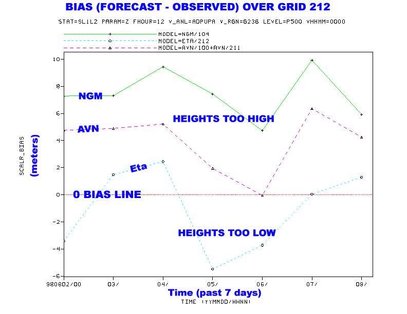
Pictured above is an example of the bias for the 500 MB heights
Bias (forecast - observed) over grid 212.
What you see: On a given plot you will see a horizontal 0 line. Model
Bias is plotted over the past 7 days for three models (ETA, NGM, and
MRF). Bias is calculated (see next paragraph for more detailed
explanation) for heights, temperatures, and relative humidity.
Therefore, the closer the plotted lines are to 0...the less bias the
output model field has (and vice versa). The plots are designed to
give you a quick method of determining which model has been performing
best over the past week (large scale pattern) for heights,
temperatures, and relative humidity.
How its derived: The Bias (forecast - observed) is calculated for each
upper air site over grid 212. The observed value is an upper air
observation and the forecast value is the bi-linear interpolated model
forecast (that is since the upper air sites don't correspond exactly
to one grid point, a linear interpolation of the 4 closest grid points
is used to compare to the observed data from the upper air site). The
bias is then calculated for each upper air site and totaled to give an
overall bias of a given model field for a given cycle. Although
veiwing the bias over such a large domain does not allow you to
acertain regional biases...these plots are designed to give you a
quick method of estimating which model has been performing best over
the past few days.
Go to the EMC Short Range Model Verification Statistics Page

