For Reuters, Arathy J Aluckal, Jitesh Chowdhury, and Vijdan Mohammad Kawoosa illustrate how the mpox virus spreads, its variants, and who it affects.
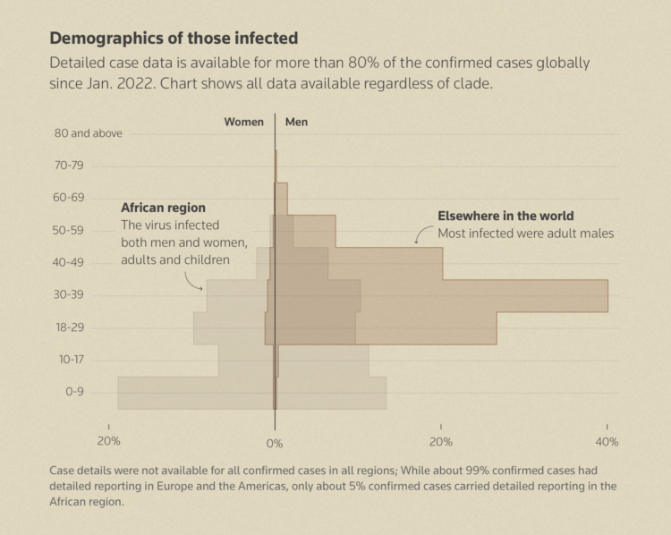
The last chart in the article, shown above, struck me as familiar but took me a second. It’s a pyramid chart that puts women on the left and men on the right. The y-axis represents age groups. You can see the contrast between those infected in the African region (men and women somewhat evenly) and the rest of the world (almost all men). The variant in Africa can spread through close contact.


