Climate Science Glossary

Term Lookup

Enter a term in the search box to find its definition.

Settings

Use the controls in the far right panel to increase or decrease the number of terms automatically displayed (or to completely turn that feature off).

Term Lookup

Settings


All IPCC definitions taken from Climate Change 2007: The Physical Science Basis. Working Group I Contribution to the Fourth Assessment Report of the Intergovernmental Panel on Climate Change, Annex I, Glossary, pp. 941-954. Cambridge University Press.

Home Arguments Software Resources Comments The Consensus Project Translations About Support

Bluesky Facebook LinkedIn Mastodon MeWe

Twitter YouTube RSS Posts RSS Comments Email Subscribe


Climate's changed before
It's the sun
It's not bad
There is no consensus
It's cooling
Models are unreliable
Temp record is unreliable
Animals and plants can adapt
It hasn't warmed since 1998
Antarctica is gaining ice
View All Arguments...


Username
Password
New? Register here
Forgot your password?

Latest Posts

Archives

Robust warming of the global upper ocean

Posted on 23 May 2010 by John Cook

Most of global warming goes into the ocean. Consequently, the amount of heat accumulating in the world's oceans is a vital cog in our understanding of climate. A number of teams across the world have performed analyses of ocean heat observations. While there's year-to-year differences between the various estimates, they all show essentially the same long-term trend. Now members from the various teams have combined their efforts into a single 'best estimate' of ocean heat (Lyman 2010). What they find is robust warming in the upper ocean over the 16 years from 1993 to 2008.

When reconstructing ocean heat content, the greatest source of uncertainty is biases in expendable bathythermograph (XBT) data. XBTs are dropped from ships and measure water temperature as they sink. One example of uncertainty is estimating how the rate at which the XBTs fall has changed over time as the instruments have subtly changed. This fall rate is used to work out the depth at which temperature is measured. The various teams working on the problem make their own choices on how to adjust for the various XBT biases. We can see the differences arising from these choices by overlaying the curves produced by each team. 
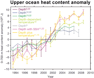
Upper ocean heat content anomaly
Figure 1: Ocean Heat Content anomaly from various teams. Ocean heat is calculated from 0 to 700 metres (Lyman 2010)
.

All the curves show significant warming of the global upper ocean  from 1993 to 2008. While there are differences in year-to-year variability, the long-term warming rates are broadly consistent. The various datasets were then combined into a 'best estimate' of ocean heat content including a comprehensive estimate of the total uncertainty. This is shown in Figure 2: the black line is the composite estimate of upper ocean heat content anomaly and the uncertainty marked in vertical black lines.
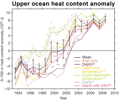
Upper ocean heat content anomaly
Figure 2: Ocean heat content anomaly curves from various teams (colour) and composite ocean heat content anomaly (black) (Lyman 2010).

In the same issue of Nature is a follow-up article, Global change: The ocean is warming, isn't it? (Trenberth 2010). Kevin Trenberth summarises the results of Lyman 2010 and gives a broader perspective. The general gist of his article is, loosely paraphrasing, "yes, the upper ocean is warming, fine, now where's my damn missing heat?!"

The most interesting feature in Trenberth's article is a comparison of upper ocean heat (the top 700 metres) versus ocean heat down to 2000 metres deep. In the following graph, the black line shows the 'best estimate' upper ocean heat curve from Lyman 2010 (the black line in Figure 2 above). The pink line is the long-term warming trend which averages 0.64 watts per square metre over the whole Earth. This is the global average, an indication of the planet's energy imbalance. The blue line is the observed rate of heat accumulating in the global ocean down to 2000 metres, calculated from von Schuckmann 2009.
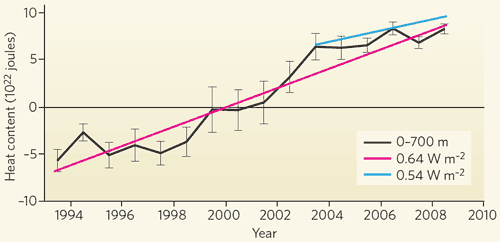
Upper ocean heat content compared with ocean heat to 2000 metres
Figure 3: Changing heat content of the global ocean. Black curve is changes in upper ocean heat content (0 to 700 metres). Pink line is trend in upper ocean heat content. Blue line is trend in ocean heat content down to 2000 metres (Trenberth 2010).

When we look at ocean heat down to 2000 metres since 2003, the global ocean has been warming at a rate of 0.77 watts per square metre. When averaged over the entire Earth, the warming is 0.54 watts per square metre. This is a rough estimate of how much heat is building up from 2003 to 2008. Note that the blue trend is greater than the black line over the same period. This means that more heat is accumulating at greater depths than 700 metres.

In summary, the oceans show a robust warming trend from 1993 to 2008. The observed rate of warming has slowed somewhat compared to the 16 year trend but the ocean is still accumulating heat.

0 0

Printable Version  |  Link to this page

Comments

1  2  Next

Comments 1 to 50 out of 78:

  1. I would like just to check the meaning of the word "robust" in this context. In statistics, a "robust estimate" is one that is not affected by small departures from model assumptions. Does the phrase "robust warming trend" have the same meaning here?
    0 0
  2. P.s. The link to Lyman(2010) needs to be fixed!
    0 0
    Response: Fixed, thanks for pointing that out.
  3. #2 tobyjoyce at 17:57 PM on 23 May, 2010 The link to Lyman(2010) needs to be fixed It must be this one: Letter Nature 465, 334-337 (20 May 2010) | doi:10.1038/nature09043; Received 8 December 2009; Accepted 22 March 2010 Robust warming of the global upper ocean John M. Lyman, Simon A. Good, Viktor V. Gouretski, Masayoshi Ishii, Gregory C. Johnson, Matthew D. Palmer, Doug M. Smith & Josh K. Willis However, before delving into the question deeper I would like to know the actual reason behind the downward modification of OHC trend for the last couple of years at NODC occuring on Wed, 20-Jan-2010 22:14 UTC. It is undocumented.
    0 0
  4. These papers are clearly important, but not so easy to read for a non-expert like me. I'll try to state what I get out of the Lyman paper, in the hope that someone can correct my misunderstanings. First a very very stupid question, but google did not help me, and maybe I'm not the only one who does not know: What precisely does the technical term "climatology" mean in contexts like "We estimate climatological uncertainties (Fig. 3, magenta line) arising from Argo versus pre-Argo sampling from pairs of curves using the same mapping routine and XBT corrections but different baseline climatologies (Fig. 2, solid vs. dashed lines)." But more importantly, what exactly are Lyman et al doing? They trust data from the new Argo floats, so that the main problem they want to adress is how to interpret the older data from the XBT sinking devices. There has been a number of attempts to translate these data into ocean heat content data. These attempts don't agree with each other (fig 1 above), and the paper is trying to reconcile the attempts. According to this study, we can break up the differences between the different published ocean heat content reconstructions into several components. I believe that the main argument is that by analysing the uncertainty in each of these component individually and adding, the uncertainty in the total ocean heat content estimate gets smaller. The main components are: Differences in XBT data sets, differences in climatology, differences in method of XBT bias corrections. The first step is to recompute the published estimates for ocean heat content, using the published algorithms for bias correction, but using the same standard dataset or the same standard climatology (which at least means choosing the same period for computing the temperature baseline, but presumably more than this). In figure 2 above, the results are compared to the original estimates, and to each other. The green line corresponds to one method of bias correction as originally published, the green dotted line to the same bias correction but with the standard climatology, the green dotted line again with the same bias correction, but with the standard raw dataset. Using the same dataset or the same climatology brings the curves closer, but they are still far from identical. The end result is that the biggest uncertainty in the estimate of ocean heat content comes from the choice of method for bias correction. I believe that they consider the published methods as having equal value, and compute a mean and standard deviation from the set of these methods. This mean is then the basis for their estimate of ocean heat content. A few points I don't understand: What is the uncertainty due to "mapping"? Is there a reason for that the uncertainty due to choice of correction is small in the beginning and the end of the period (around 1996 and 2006), and bigger in the middle (around 2000) - that looks strange to me?
    0 0
  5. Bérenyi Péter> The papers in question here discuss the trend in ocean heat content up to 2008. As far as I can see, the corrections you mention cannot have much influence on this.
    0 0
  6. #4 Marcel Bökstedt at 21:32 PM on 23 May, 2010 Is there a reason for that the uncertainty due to choice of correction is small in the beginning and the end of the period (around 1996 and 2006), and bigger in the middle (around 2000) - that looks strange to me? Yes. Instrumentation has changed a lot in this time interval. There is also a gap between 1996 and 2002 when old (MBT/XBT) systems were all but abandoned and ARGO was not deployed en masse yet. The huge and abrupt increase in OHC at the end of this period must be an artifact due to intercalibration problems and lack of data. It is also inconsistent with satellite radiation budget measurements. It is only the last 6 years when OHC in the upper 700 m of oceans is measured properly. It is decreasing. Below that level even recent data are unreliable, because ARGO floats in the tropics initially have not worked according to design. The guys didn't dare to let them go down to 2000 m for they would never come back to the surface in waters warm enough.
    0 0
  7. Berényi Péter, "It is only the last 6 years when OHC in the upper 700 m of oceans is measured properly. It is decreasing" Apparently not.
    0 0
  8. As oceans warm over time, for the "same" air temperature, oceans should warm less as per convective heat transfer law. Would this not constitute negative feedback?
    0 0
  9. This statement near the end of the post confuses me, "Note that the blue trend is greater than the black line over the same period. This means that more heat is accumulating at greater depths than 700 metres." The deep data (blue line in Figure 3) have a SMALLER slope than the shallow data (red). It's the slope that matters, isn't it?
    0 0
  10. Jeff T, the red line is the trend from 1993 while the comparison with the Argo 0-2000 data (blu line, 0.54 W/m2) has to be made starting from 2003, in which case the trend is down to about 0.23 W/m2.
    0 0
  11. According to Lyman et al. 2010 clearly there is no OHC decrease in the last 6 years, trenberth paper is available here.
    0 0
  12. Berényi I hear what you're saying about XBT versus ARGO data but I have to say I find it hard to imagine that the total (and rather astoundingly large) difference in heat content between the left and right end of the graph is all down to instrumentation error. That would imply that the instrumentation is entirely worthless, which I believe would be a fairly controversial assertion and probably very hard to defend in detail.
    0 0
  13. RSVP while sadly I do not have the skill or background necessary to provide a proper answer, I imagine that if the upper ocean is unable to convey heat to the lower ocean with sufficient speed, the upper ocean will indeed become less effective at mopping up heat from the atmosphere, so we could then expect to see the atmosphere begin to warm more rapidly. Veering off into complete speculation, this is sort of consistent with what we see and even fits with Berényi's assertion that the ocean is taking up less heat of late. But I don't really know enough about what I'm talking about, so take it with a salt dome.
    0 0
  14. In all these discussions, it's wise to remember that our ability to track ocean heat content changes to the accuracy shown in the figures (say 1-2 x 10^22 J) is very new. It results from a combination of two things: Argo and some very careful reanalysis of XBT data. As recently as 2005, the accepted time series of ocean heat content (Levitus et al 2005, Figure 1) showed a peak in OHC centred ~ 1980 and a drop of 5 x 10^22 J between 1980-1985. People were wondering why the OHC variability in climate models did not match the observations. It turns out (Levitus et al 2009, Figure 1) that this variability was over-estimated due to instrumental problems. The Lyman et al work (Figures 1 and 2 in this post) still shows quite large discrepancies between different analyses and I for one am sceptical that the data are accurate enough to support Trenberth's confident assertions about "missing heat" over a period as short as 5 years. Refs: Levitus, S.; Antonov, J.I.; Boyer, T.P. (2005). Warming of the world ocean, 1955-2003. Geophysical Research Letters 32(L02604): doi:10.1029/2004GL021592 Levitus, S.; Antonov, J.I.; Boyer, T.P.; Locarnini, R.A.; Garcia, H.E.; Mishonov, A.V. (2009). Global ocean heat content 1955–2008 in light of recently revealed instrumentation problems. Geophys. Res. Lett. 36.
    0 0
  15. hadfield, actually Trenberth 2010 is calling for more and better data: "This discrepancy suggests that further problems may be hidden within the ocean observations and their processing. It also highlights the need to do better, and the prospects for that." John, the link to Lyman is still broken in the caption of fig.2. Link to Trenberth is broken both in the caption and in the text.
    0 0
    Response: Okay, I think all the broken links are now fixed, all 7 of them. Not my best work.
  16. #14 hadfield at 08:27 AM on 24 May, 2010 I for one am sceptical that the data are accurate enough to support Trenberth's confident assertions about "missing heat" over a period as short as 5 years Here is a magnified version of the last 6 years from NODC Ocean Climate Lab OHC graph. It is clearly decreasing somewhat. On the other hand if recent globally averaged energy imbalance at TOA is +0.54 Wm-2 as claimed, in six years OHC should have increased by 5×10²² Joules. It is not seen. As OHC is not measured properly in depths greater than 700 m while above it accuracy and precision has improved tremendously after 2003 due to ARGO, one has to invent a hypothetical process capable to push that much heat below the line without even touching the upper layer. I have not seen a reasonable explanation yet. If you know one, put it forward please. Until that time Trenberth's travesty is well and alive. BTW, the NODC Ocean Climate Lab has no explanation for the recent downward adjustment at their website. All they have is Levitus 2009 but of course it has nothing to say about something done in this January.
    0 0
  17. Berényi, going from the micro and back to the macro view, do you think the graph you reproduce here should be taken as indicating no heating of the ocean? My point is, I see a lot of up-down on the scale you reproduced here but when we look at a longer interval those wiggles are overwhelmed by what looks to the untrained eye as an enormous uptake of heat. What's your conclusion? Is the entire instrumental we have completely unreliable to the point that even the little bit of data you present is meaningless? If it is meaningless, why are you using it and how can you conclude that there is a decrease in OHC in the period you show?
    0 0
  18. One curious fact: in figure 1, there is a considerable divergence between the datasets after 2003. In figure 2, they seem to converge as they approach present time (roughly 2009). What is the reason?
    0 0
  19. What I see from that close up is a "wobble" between 10*10^22-13*10^22 Joules between 2004 & 2009. The peaks seem to correspond quite nicely to periods of higher & lower atmospheric temperature. Also, Berenyi, you mustn't forget that incoming solar radiation was also falling significantly over this time period, which might also explain an overall lack of growth in the Oceanic Heat Content.
    0 0
  20. NODC data seems to contain some cooling biases relating to Druck pressure sensors which have not been corrected. These problems start in 2003: WORLD OCEAN DATABASE 2009 (see chapter 6.6 for data problems)
    0 0
  21. That's a really useful (and fascinating for instrument enthusiasts) compendium of information, Ari. Here's the relevant section on various errors which have cropped up as the ARGO system has gone through its "teething pains" and adolescent years: "In 2003, it was found that problems with the Druck Pressure Sensor were causing some floats to stay at the surface for prolonged periods and eventually to become surface drifters. The Druck Pressure Sensor is the successor to the Paine pressure sensor in Seabird CTDs. Even when not severe, the problem may have caused errors in the salinity measurement due to increased biofouling due to prolonged surface exposure. When the problem was found, the CTDs were recalled and the source of the problem was fixed, but this was not possible for floats already deployed. A large number of SOLO floats with FSI CTD packages deployed in the Atlantic Ocean between 2003 and 2006 were found to have a pressure offset problem due to a software error. This error caused pressures to be paired with the temperature measurements from the next lower level, creating the illusion of a cooling ocean. Once the problem was found, a list of such floats was compiled. An effort was made to correct the problem, successful in some floats, not in others. All data from all these problem floats are included in WOD09. For those data which could not be corrected, all float cycles are flagged. More recently, in early 2009, a problem with the Druck pressure sensor has been found (J. Willis and D. Roemmich, minutes of 10th meeting of International Argo Steering Team). This problem causes pressure sensor drift after deployment. Deployment of new floats was halted temporarily, until the pressure sensor design could be altered. Already deployed APEX floats are being monitored closely for sensor drift. The full extent of this problem is not yet apparent"
    0 0
  22. A joint effort between groups (usually in competition) to improve the scientific understanding is a great thing. Congrats. From Peru, this is exactly what this new paper is addressing, the switch from XBT to Argo floats.
    0 0
  23. Bérenyi Péter> Yes, the behaviour of the bias uncertainty around 2006 should be reated to the shift to ARGO. The more curious thing is that the bias-related uncertainty goes up from 1996 to 2000, but maybe you solved that too, if the XBT system was deteriorating, this could introduce more uncertainty. I don't quite see how the increase in ocean heat content up to 2003 can be a measurement error due to change of instrumentation, it seems that the old XBT system was still in place (possibly on a lower level), so there was no big change of instruments there? The recent argo data seem to present a big problem. There are several things to explain simultaneously. Why did the upper level ocean heat content rise in 19993-2003, and then stop rising? Can we account for both the total energy content ("closing the energy budget") and the observed sea level rise? As long as we can't explain all of this, something is so missing. A mechanism to transfer heat down into the ocean would be one possible way to start resolving it. It might not work out of course. If the ocean is taking up less energy recently, this just leads to a new mystery: Why did the behaviour of the ocean suddenly change in 2003? From Peru> Figure 1 are the original curves as published by various authors. In Figure 2 the same curves have been recomputed with changes in the input data. That is, they use the same method of bias correction as the original authors, but with three types of homogenizations in the input data. The homogenizations used with a certain bias correspond to the three curves in fig 2 with the same color. So it is not so surprising that the curves in fig 2 are closer than those in fig 1, some (but not all) or the causes of difference has been eliminated. I believe that the reason for that the authors are doing this is to analyse the difference between published estimates of OHC. The idea is that the differences come from several independent differences in the approaches: The dataset, the bias correction method, and the choice of baseline climatology (I'm still not sure what the last means, but something like what period is considered as baseline).
    0 0
  24. BP#6 has probably got the intepretation about right. Figure 2 shows a huge increase in OHC from roughly a 2 year period 2001 to 2003 in which the OHC rises from the zero axis to about 7E22 Joules or about 700E20 Joules. This is about 350E20 Joules/year heat gain. Dr Trenberth's 0.9W/sq.m TOA energy flux imbalance equalled 145E20 Joules/year. Therefore a rise of 350E20 Joules/year in OHC equals about 2.1W/sq.m TOA imbalance - a seemingly impossible number. Coinciding with the start of full deployment of the Argo buoys around 2003-04 this impossibly steep rise in 2001-03 looks like an offset calibration error. Similar would apply to Fig 3. In such case, fitting a linear curve from 1993-2009 and calling it a 'robust' 0.64W/sq.m is just nonsense. One might also note that the better the Argo coverage and analysis gets from about 2005 onward - the more the teams curves converge on a flattening trend - no OHC rise - no TOA imbalance.
    0 0
  25. I've not heard anybody yet be so bold as to dismiss the entire instrumental record- splices and other warts included- as "just nonsense." Is anybody expressing skepticism of this result prepared to explain how the OHC difference between the left and right ends of the graph is "just nonsense?" If so, can you explain exactly how so many years of data was collected and so much work expended in a meaningless effort? Can you do that in detail?
    0 0
  26. Actually I have some difficulty on the critics people are making here. The aim of the paper was exactly to address the well known problem of XBT vs Argo periods. The final result is the black curve in fig. 2 here. It shows a steady increase starting around 1998 (or earlier) and a smaller (not null) trend after 2003/04 for the next 5 years. The authors are, of course, well aware of the possible meaning: "The fact that this transition occurred at the same time as the flattening could be oincidental, but also raises the possibility of a yet-undiscovered bias in the observing system." Trenberth 2010 adds that substantial warming is found when considering the full depth data "indicating that substantial warming may be taking place below the upper 700 m". ((Some more details here). It's surprising how people can be so superficial to claim they know the answer by eyeballing the graph and without, apparently, any evidence but "coincidence". For scientists it is left as an open question, as it should. Neverthless, this dataset represents the best of our knowledge, given the joint effort to produce it. As for TOA imbalance, OHC trend and the like, never forget that we all know that it's a travesty we cannot track the flow of energy through the climate system in the short run.
    0 0
  27. Further to my earlier remark, for those wishing to dismiss the entire collective anomaly apparently revealed by OHC measurements you'd do well to begin by reading and comprehensively understanding the item pointed out by Ari, the WORLD OCEAN DATABASE 2009, then extend your effort to a point where you feel your expertise exceeds that of the authors of this study. At that point you'll be prepared to offer some useful critique. Short of that-- short of some miracle-- your offering will inevitably reside in the "I doubt it" arena in terms of utility with drawing conclusions.
    0 0
  28. Doug, remember that the world ocean database document is only for the data analysis in NODC. The "official" situation of Argo can be found from Argo website. The Argo information centre there is the interesting thing for the discussion here. There is an item in the news list saying "Advice on Pressure Biases in the Argo Data Set", it says: "A part of the global Argo data are subject to biases in reported pressures. These biases are usually less than 5db, but occasionally can be larger (> 20db). These bias errors are being steadily removed by the reprocessing of historical Argo data. We expect that by the end of 2010 these errors will be removed from the global Argo data set in both the delayed-mode and real-time data." So it seems that next year we will have a better idea of how much of less warming of post-2003 has been due to the pressure sensor problem. So far studies have just rejected the bad Argo floats from the analysis (this latest study included), so it will be interesting to see the end result, when the data has really been corrected. But I bet there's still something else biasing the Argo-data that we don't know about.
    0 0
  29. It'll be interesting to see what does come of the pressure sensor problem. I should take my own advice and go try to find out how many buoys are suspect, whether the manner in which the buoys are run can cause a measurement error in gross heat content as opposed to simply making it more difficult to obtain a depth/heat profile. I suppose that's already been done by the operators for that matter. Great website, Ari. A tremendous compendium of papers; well done!
    0 0
  30. #26 Riccardo at 01:20 AM on 25 May, 2010 As for TOA imbalance, OHC trend and the like TOA imbalance is extremely important. Below is satellite measurement for the last ten years: These measurements have low accuracy but reasonable precision. It means that the curves above have an arbitrary offset (within several Wm-2), but would show a marked level change whenever accumulation rate of thermal energy changes in the climate system. Nothing like that is seen between 2002-2004. Therefore either satellite data are absolutely useless or the 6-8×10²² J heat accumulation in the oceans after 2000 followed by a more or less level plateau from 2004 on is an artifact due to transition to ARGO. There is no other possibility. Net TOA radiative imbalance should be very nearly identical to the temporal derivative of OHC, because there is no heat storage capacity in the climate system comparable to the oceans and all energy exchange between Earth and its environment is mediated by electromagnetic radiation (any other forms of energy transfer, e.g. tidal breaking are many orders of magnitude smaller). For scientists it is left as an open question, as it should. The open question is not the "missing heat" but inconsistency between satellite and buoy measurements of energy budget and inconsistency between measurements and computational model predictions. The often quoted more than 0.5 Wm-2 positive global energy imbalance is not measured in any reasonable sense. It is a model prediction, all but falsified by now.
    0 0
  31. Berényi, can I take your analysis as a "yes" on my question of whether anybody believes the current OHC measurement capability is entirely unable to detect a trend in temperature? Assuming that to be the case, is it capable of any useful measurements at all? Can you place any boundaries on its accuracy, and if so can you show how?
    0 0
  32. Berényi I just read your post more carefully and I should amend my question. Do you see a possibility that OHC has in fact increased during the period examined by Lyman et al, and if so do you have a reasonably complete mechanism in mind to explain how it may have completely failed in reliability after ~2003? I think you need to supply more detail to describe how the failure you see has occurred.
    0 0
  33. Berényi Péter, i'm not going to follow you along this path. You are arbitrarly forcing the dichotomy yes/no, right/wrong, to make your preconceived point. The reality of good research is different by definition. As pointed out in my previous comment we all agree and know that there are problems and science is finding problems and trying to solve them as best as we can. This is what Lyman et al did and it's a good job. You've not been able to find any valid reason to dismiss the paper and it is only your a-scientific dichotomy that allos you to say that it's all wrong. In this way you're putting yourself outside the realm of science. And this is why I won't follow you.
    0 0
  34. roger pielke snr's article, My Perspective On The Nature Commentary By Kevin Trenberth is relevant to this discussion
    0 0
  35. It strikes me that for amateurs to dismiss a paper by professionals published in Nature as 'Just nonsense" and "not measured in any reasonable sense" based on eyeballing their graphs is just nonsense and not reasonable. Please provide citations of reviewed papers that show the problems you claim are obvious.
    0 0
  36. 1.tobyjoyce I guess robust means 16years. And those 16 years can be separated into three phases. 4 years of little to no warming, 6 years of intense warming and finally 6 years of no warming. That would be what robust means. But this sort of detail gets in the way of the message which is the oceans are warming.
    0 0
  37. 33.Riccardo It is a good job that Lyman do in pulling together the available data on OHC. The problem for me comes in the robustness of conclusions. The only tools designed to do the job this paper describes are teh Argo floats. These have yet to find a warming signal in the 5 or so years they've been operating. It seems extra-ordinary based on this fact alone that you would come to the conclusion this paper has. Place this data in the real world and as Trenberth says it still doesn't account for the missing heat. Having said that speculation on the missing heat seems even more wild given there doesn't seem to be any attempt to link the missing heat with any real world physical process that would allow the heat to go missing. It seems a really strange time to make such a forthright statement on this aspect of climate change when the data would not seem to fully support the climate change hypothesis.
    0 0
  38. HumanityRules, the main effort was on the bias corrections of the XBT data, considered the weak part of the OHC dataset. Then the full dataset allow the author (not me!) to come to more robust conclusions. Your claim that there has not been any attempt to close the energy budget is astonishing. Many scientists has worked on that for years and are still working. Anyways, keep in mind that the they are missing the closure for a few tenth of W/m^2; unacceptably large, ok, but still they're not completely missing the goal. Finally, the closure of the energy budget does not prove or disprove anything about climate change and AGW theory. It's just about the ability to measure the energy of our planet, about the understanding of how our climate works.
    0 0
  39. Humanity Rules @36, Although I gather you were aiming at sarcasm, I believe you're approaching a reasonable explanation of what John was getting at in using the term "robust". Bearing in mind that climate is defined on the basis of long-term trends--variously defined at 20 or 30 years--shorter term oscillations of 4 to 6 years such as you describe, are not meaningful in quantifying the effects of climate change. Thus, although your description, "4 years of little to no warming, 6 years of intense warming and finally 6 years of no warming" might evoke some guffaws from those who question the validity of AGW, your usage of the term "warming" is different from its intended meaning with respect to climate change. Assuming the data have been measured and processed reasonably, the observed increase in temperature provides robust evidence of a warming climate on a multi-decadal scale. Given the uncertainty in the data, however, and the shortness of the measurement interval, we're still not sure of the longer term trend. I seem to detect an "inconsistency" in how temperature data are treated by AGW skeptics. On the one hand, some argue that the data are biased toward warming or are otherwise unreliable, er.... that is, until we hit a few years of (apparently!) declining temperature, at which point the previously worthless data suddenly provide clear evidence that warming has stopped! What's up with that?! The more valid question here, is whether the "offset" in the temperature data noted by Berényi Péter@ #6 is a relict of the measurement methodology. The difference in temperature from 2002 to 2004 appears to be statistically significant, yet we can't define meaningful trends on the basis of just 2 or 3 data points. Unfortunately, I'll have to defer to qualified experts to sort this out. In the meantime, given the importance of the answer, I will agree that it is indeed a travesty that we can't do better at present.
    0 0
  40. #32 doug_bostrom at 07:26 AM on 25 May, 2010 Do you see a possibility that OHC has in fact increased during the period examined by Lyman et al, and if so do you have a reasonably complete mechanism in mind to explain how it may have completely failed in reliability after ~2003? I don't think it has failed after ~2003. That was the year when global coverage increased tremendously both in extent and density. The quality of instruments also improved a lot, even if some of the ARGO floats used to have problems. Therefore I think OHC data after mass deployment of ARGO floats is more reliable than before. You may consider checking the analysis provided at the Does ocean cooling prove etc. thread. I don't have anything against the early part of the Lyman reconstruction either. However, the huge rise in their OHC history reconstruction between 2000 and 2004 is not supported by net radiation budget at TOA which was measured in this period indeed. Also, there is very little temporal overlap between XBT and ARGO measurements with small chance for proper intercalibration. In fact the otherwise indeterminate offset of net radiation budget at TOA can be calibrated against the last 6 years of ARGO OHC data. OHC should be close to the temporal integral of the former signal with little delay because heat storage capacity of climate system is absolutely dominated by the oceans. If it is done, OHC increase during the last 15 years turns out to be much less than claimed by Lymann. #35 michael sweet at 09:17 AM on 25 May, 2010 It strikes me that for amateurs to dismiss a paper by professionals Please try to digest first what is said. Follow the links if necessary. Science is not about blind faith in professionals, nor it is about appeal to authority. It is about understanding. If you find answers you do understand to questions I have raised here in papers published by professionals in the peer reviewed literature, you are most welcome should you decide to share it. The same applies to the case you happen to find valid answers on your own.
    0 0
  41. Berényi Péter, the heat budget as we know it does not close and no one knows why. I assume you don't know either. Logically, you cannot draw any conclusion from TOA imbalance and OHC, let alone using the OHC to calibrate TOA imbalance. The graph you keep posting shows a steady increase in the number of Argo profiles from 2001 to 2008. The jump in OHC you claim as an indication of XBT bias is between 2001 and 2003. The two do not match so it is easily discarted as an explanation of the jump. All the known sources of bias of the XBT data has been taken into account by Lyman et al. 2010. Definitely there might be more but no one has identified them yet. I assume you didn't either. What's left are just speculations and as such should be taken.
    0 0
  42. 39.CoalGeologist pielke snr in one of his posts suggests that 70% of the increase in OHC seen in this study is accounted for by just 3 years (1999, 2002 and 2003). You can draw a line from 1994 to 2009 and describe a trend the question might be what is the relevance of that. It's naive to suggest just AGW sceptics use the data to tell a particular story. Anybody have any general thoughts on how the very large interannual variability in OCH change impacts on our understanding of real world processes in the ocean? I have in my head that the oceans are a very stable environment. For example this diagram shows much of the volume of the ocean is homogenous, do we have to start thinking that the ocean is much more dynamic in it's transport of energy than we classically thought? Volumetric temperature-salinity diagram of the world ocean. 75% of the ocean's water have a temperature and salinity within the green region, 99% have a temperature and salinity within the region coloured in cyan. The warm water outside the 75% region is confined to the upper 1000 m of the ocean.
    0 0
  43. BP#30. CoalGeologist #39, Riccardo #41 BP #30 came up with a jump of 6-8E22 Joules in OHC between 2000 and 2004, and I read Fig 2 as about 7E22 Joules 2001-2003. This translates to a TOA imbalance of about 2.1W/sq.m when model based estimates (Dr Trenberth) calculate 0.9W/sq.m over a similar period. Sharp jumps in short time periods which match the transition to Argo from a much smaller more fragmented XBT system can only be an offset error - an artefact of the transition. A similar jump occurred with the SORCE TIMS monitors which since 2005 read 4.5W/sq.m lower TSI that prior satellites. No-one is trying to splice TIMS to prior satellites or we would have a big drop in incoming solar radiation - a similar offset problem as XBT and Argo. BP is simply applying the first law ie. conservation of energy. If there is an imbalance at TOA then the energy must show up somewhere in the biosphere and the oceans have vastly greater capacity than the land or atmosphere (or ice melt)to store heat energy. The integral of the TOA energy flux imbalance WRT time should show up in the increase in OHC. Where else could it feasibly be absorbed in sufficient quantity? As far as six years of flat OHC data being insufficient to drawing conclusions on warming - then explain where the missing heat is stored in this period when CO2GHG theory requires a continuous and increasing TOA imbalance of about 0.9W/sq.m and rising.
    0 0
  44. Ken Lambert, are you looking here for the answer on the missing heat when professional scientists couldn't yet? The difference between me and you (and BP) is that I do not try to solve the problem by so naively applying conservation of energy. I'm sure that any scientist knows about conservation of energy ...
    0 0
  45. #41 Riccardo at 22:57 PM on 25 May, 2010 The jump in OHC you claim as an indication of XBT bias is between 2001 and 2003. The two do not match so it is easily discarted as an explanation of the jump Notice change in ARGO coverage please. Current status: #43 Ken Lambert at 00:31 AM on 26 May, 2010 BP is simply applying the first law ie. conservation of energy. etc., etc. Thanks. This is exactly what I was trying to say.
    0 0
  46. Berényi Péter, big changes up to almost now while the OHC short term trend slowed down, good confirmation. But we knew that already from the discussion in the other post, we're repeating ourselves.
    0 0
  47. Humanity Rules (@42): The relevance of a trend line, as in Figure 3 (above), depends entirely on the accuracy of the data. If the data are accurate, so is the trend; but our argument becomes circular at this point, and I don't think we can take it much further until the data are further corroborated. I will only add that poor Kevin Trenberth is already anguishing over his missing heat, and apparently (?) Pielke Sr. wants to take away another 70%?! If he's correct, we'll need a stronger word than "travesty". Unfortunately, Dr. Trenberth has left us little linguistic ground, other than by adding a few choice expletives in front! I don't think I'm being naive. Dr. Pielke Sr. has persistently raised skeptical questions regarding the accuracy of the surface temperature data, and thus plays an important (even if occasionally nettlesome) role in the scientific method. For every Pielke Sr., however, there are countless AGW Denialists who cherry pick or otherwise distort the data to serve their desired conclusion. Finally, in the spirit of multiple working hypotheses, I will suggest that the once tranquil water column in the ocean has been stirred up by fishing trawlers trying to fulfill humanity's (Yes, That means you!) appetite for Omega-3 oils. It's not easy feeding 6.7 gigapeople. (BTW... I'm kidding.)
    0 0
  48. Thanks for the reply, Berényi. In sum I guess most folks agree that Lyman's graph shows an increase in heat content of the upper ocean, leaving a couple of open issues. --Poor confidence in the marriage of XBT data w/ARGO observations leading to what may be interpreted as an artificial discontinuous jump in OHC during the transition period. My problem with that is the same as with my ability to describe what I think -may- be a countervailing argument. As ARGO has superseded XBT and simultaneously has been refined in accuracy, if indeed there had been an artificial discontinuity introduced its seems plausible we should have seen an overt seeming -decrease- in OHC as the discontinuity was revealed as artificial in subsequent years of improved measurement conclusions. We do not see a decrease of that kind, certainly not w/statistical significance. So perhaps either the discontinuity was simply an extra large case of variability or subsequent addition of heat has overwhelmed the effect of discontinuity as an artifact. Maybe; as I say it's a problem because I don't have the intimate knowledge of the measurement acquisition and processing system to form a useful conclusion. Unfortunately I don't think any of us here do. --If indeed total OHC has been increasing despite what seems to be a recent slackening of upper ocean heat content increase, where's it going? Seeing that the upper ocean is not effectively isolated from the lower approximately 1/2 of the ocean, a reasonable intuition would be that the missing heat is finding its way into the portion of the ocean where we don't have dense instrumentation and in fact measurements are quite spotty. In fact there are some strong hints to the effect that the lower ocean is warming on a broad scale: Recent western South Atlantic bottom water warming Geophysical Research Letters 33 (2006) Johnson, Gregory C.; Doney, Scott C. Abstract: Potential temperature differences are computed from hydrographic sections transiting the western basins of the South Atlantic Ocean from 60°S to the equator in 2005/2003 and 1989/1995. While warming is observed throughout much of the water column, the most statistically significant warming is about +0.04°C in the bottom 1500 dbar of the Brazil Basin, with similar (but less statistically significant) warming signals in the abyssal Argentine Basin and Scotia Sea. These abyssal waters of Antarctic origin spread northward in the South Atlantic. The observed abyssal Argentine Basin warming is of a similar magnitude to that previously reported between 1980 and 1989. The Brazil Basin abyssal warming is similar in size to and consistent in timing with previously reported changes in abyssal southern inflow and northern outflow. The temperature changes reported here, if they were to hold throughout the abyssal world ocean, would contribute substantially to global ocean heat budgets. Warming and Freshening in the Abyssal Southeastern Indian Ocean J. Clim. 21, 5351–5363 (2008). GREGORY C. JOHNSON, SARAH G. PURKEY, JOHN L. BULLISTER ABSTRACT Warming and freshening of abyssal waters in the eastern Indian Ocean between 1994/95 and 2007 are quantified using data from two closely sampled high-quality occupations of a hydrographic section extendingfrom Antarctica northward to the equator. These changes are limited to abyssal waters in the Princess Elizabeth Trough and the Australian–Antarctic Basin, with little abyssal change evident north of the Southeast Indian Ridge. As in previous studies, significant cooling and freshening is observed in the bottom potential temperature–salinity relations in these two southern basins. In addition, analysis on pressure surfaces shows abyssal warming of about 0.05°C and freshening of about 0.01 Practical Salinity Scale 1978 (PSS-78) in the Princess Elizabeth Trough, and warming of 0.1°C with freshening of about 0.005 in the abyssal Australian–Antarctic Basin. These 12-yr differences are statistically significant from zero at 95% confidence intervals over the bottom few to several hundred decibars of the water column in both deep basins. Both warming and freshening reduce the density of seawater, contributing to the vertical expansion of the water column. The changes below 3000 dbar in these basins suggest local contributions approaching 1 and 4 cm of sea level rise, respectively. Transient tracer data from the 2007 occupation qualitatively suggest that the abyssal waters in the two southern basins exhibiting changes have significant components that have been exposed to the ocean surface within the last few decades, whereas north of the Southeast Indian Ridge, where changes are not found, the component of abyssal waters that have undergone such ventilation is much reduced. Recent Bottom Water Warming in the Pacific Ocean GREGORY C. JOHNSON, SABINE MECKING, BERNADETTE M. SLOYAN AND SUSAN E. WIJFFELS J. Clim. 20, 5365–5375 (2007). ABSTRACT Decadal changes of abyssal temperature in the Pacific Ocean are analyzed using high-quality, full-depth hydrographic sections, each occupied at least twice between 1984 and 2006. The deep warming found over this time period agrees with previous analyses. The analysis presented here suggests it may have occurred after 1991, at least in the North Pacific. Mean temperature changes for the three zonal and three meridional hydrographic sections analyzed here exhibit abyssal warming often significantly different from zero at 95% confidence limits for this time period. Warming rates are generally larger to the south, and smaller to the north. This pattern is consistent with changes being attenuated with distance from the source of bottom water for the Pacific Ocean, which enters the main deep basins of this ocean southeast of New Zealand. Rough estimates of the change in ocean heat content suggest that the abyssal warming may amount to a significant fraction of upper World Ocean heat gain over the past few decades. Rumor has it that the instrumentation situation in the deep ocean is going to be improved so while revisitations of the kind Johnson et al are doing are currently our best way of gathering data on deep OHC, we can expect to have a more comprehensive picture of the situation in a few years.
    0 0
  49. 47.CoalGeologist i'm not so concerned about the accuracy of the data. It's the best we've got and have to accept that. What I'm concerned about is taking highly variable data, drawing a straight line through it and saying look it's AGW. This is not an objective process like writing down readings from an instrument. For every argument that says this is a valid approach there is one which will question the validity.
    0 0
  50. 48.doug_bostrom "Seeing that the upper ocean is not effectively isolated from the lower approximately 1/2 of the ocean" I had it in my head that the deep and upper ocean are effectively isolated in our classical understanding. The known mechanisms tranfer relatively small amounts of energy to the deep on a year to year basis. Look at the difference in heat accumulation in 2003 and 2004. Given that the ocean is just sitting there absorbing the suns energy then those large differences need to be accounted for before you can start asigning causality.
    0 0

1  2  Next

You need to be logged in to post a comment. Login via the left margin or if you're new, register here.


The Consensus Project Website

THE ESCALATOR

(free to republish)


© Copyright 2025 John Cook
Home | Translations | About Us | Privacy | Contact Us
pFad - Phonifier reborn

Pfad - The Proxy pFad of © 2024 Garber Painting. All rights reserved.

Note: This service is not intended for secure transactions such as banking, social media, email, or purchasing. Use at your own risk. We assume no liability whatsoever for broken pages.


Alternative Proxies:

Alternative Proxy

pFad Proxy

pFad v3 Proxy

pFad v4 Proxy