Climate Science Glossary

Term Lookup

Enter a term in the search box to find its definition.

Settings

Use the controls in the far right panel to increase or decrease the number of terms automatically displayed (or to completely turn that feature off).

Term Lookup

Settings


All IPCC definitions taken from Climate Change 2007: The Physical Science Basis. Working Group I Contribution to the Fourth Assessment Report of the Intergovernmental Panel on Climate Change, Annex I, Glossary, pp. 941-954. Cambridge University Press.

Home Arguments Software Resources Comments The Consensus Project Translations About Support

Bluesky Facebook LinkedIn Mastodon MeWe

Twitter YouTube RSS Posts RSS Comments Email Subscribe


Climate's changed before
It's the sun
It's not bad
There is no consensus
It's cooling
Models are unreliable
Temp record is unreliable
Animals and plants can adapt
It hasn't warmed since 1998
Antarctica is gaining ice
View All Arguments...


Username
Password
New? Register here
Forgot your password?

Latest Posts

Archives

The Skeptical Science temperature trend calculator

Posted on 27 March 2012 by Kevin C
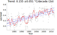
Temperature trend calculatorSkeptical Science is pleased to provide a new tool, the Skeptical Science temperature trend uncertainty calculator, to help readers to evaluate critically claims about temperature trends.

The trend calculator provides some features which are complementary to those of the excellent Wood For Trees web site and this amazing new tool from Nick Stokes, in particular the calculation of uncertainties and confidence intervals.

Start the trend calculator to explore current temperature data sets.
Start the trend calculator to explore the Foster & Rahmstorf adjusted data.

What can you do with it?

That's up to you, but here are some possibilities:

  • Check if claims about temperature trends are meaningful or not. For example, you could check Viscount Monckton's claim of a statistically significant cooling trend at 4:00 in this video.
  • Examine how long a period is required to identify a recent trend significantly different from zero.
  • Examine how long a period is required to identify a recent trend significantly different from the IPCC projection of 0.2°C/decade.
  • Investigate how the uncertainty in the trend varies among the different data sets.
  • Check the short term trends used in the 'sceptic' version of the 'Escalator' graph,  and the long term trend in the 'realist' version for significance.

Health warnings

As with any statistical tool, the validity of the result depends on both the expertise and the integrity of the user. You can generate nonsense statistics with this tool. Obvious mistakes would be calculating the autocorrelations from a period which does not show an approximately linear trend, or using unrealistically short periods.


Background

Temperature trends are often quoted in the global warming debate. As with any statistic, it is important to understand the basis of the statistic in order to avoid being misled. To this end, Skeptical Science is providing a tool to estimate temperature trends and uncertainties, along with an introduction to the concepts involved.

Not all trends are equal - some of the figures quoted in the press and on blogs are completely meaningless. Many come with no indication of whether they are statistically significant or not.

Furthermore, the term ‘statistically significant’ is a source of confusion. To someone who doesn’t know the term, ‘no statistically significant trend’ can easily be misinterpreted as ‘no trend’, when in fact it can equally well mean that the calculation has been performed over too short a time frame to detect any real trend.

Trend and Uncertainty

Whenever we calculate a trend from a set of data, the value we obtain is an estimate. It is not a single value, but a range of possible values, some of which are more likely than others. So temperature trends are usually expressed something like this: β±ε °C/decade. β is the trend, and ε is the uncertainty. If you see a trend without an uncertainty, you should consider whether the trend is likely to be meaningful.

There is a second issue: The form β±ε °C/decade is ambiguous without an additional piece of information: the definition of uncertainty. There are two common forms. If you see an uncertainty quotes as ‘one sigma’ (1σ), then this means that according to the statistics there is a roughly 70% chance of the true trend lying between β-ε and β+ε. If you see an uncertainty quoted as ‘two sigma’ (2σ), then this means that according to the statistics there is a roughly 95% chance of the true trend lying between β-ε and β+ε. If the trend differs from some ‘null hypothesis’ by more than 2σ, then we say that the trend is statistically significant.

How does this uncertainty arise? The problem is that every observation contains both the signal we are looking for, and spurious influences which we are not - noise. Sometimes we may have a good estimate of the level of noise, sometimes we do not. However, when we determine a trend of a set of data which are expected to lie on a straight line, we can estimate the size of the noise contributions from how close the actual data lie to the line.

Uncertainty increases with the noise in the data

The fundamental property which determines the uncertainty in a trend is therefore the level of noise in the data. This is evident in the deviations of the data from a straight line. The effect is illustrated in Figure 1: The first graph is from the NASA GISTEMP temperature record, while the second uses the adjusted data of Foster and Rahmstorf (2011) which removes some of the short term variations from the signal. The adjusted data leads to a much lower uncertainty - the number after the ± in the graph title. (There is also a second factor at play, as we shall see later.)
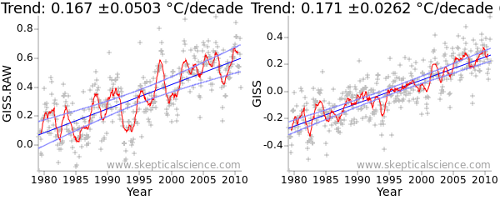
Temperature trends and uncertainties

The uncertainty in the trend has been reduced from ~0.05°C/decade to less than 0.03°C/decade.

Note that the definition of noise here is not totally obvious: Noise can be anything which causes the data to deviate from the model - in this case a straight line. In some cases, this is due to errors or incompleteness of the data. In others it may be due to other effects which are not part of the behaviour we are trying to observe. For example, temperature variations due to weather are not measurement errors, but they will cause deviations from a linear temperature trend and thus contribute to uncertainty in the underlying trend.

Uncertainty decreases with more data (to the power 3/2)

In statistics, the uncertainty in a statistic estimated from a set of samples commonly varies in inverse proportion to the square root of the number of observations. Thus when you see an opinion poll on TV, a poll of ~1000 people is often quoted as having an uncertainty of 3%, where 3% = 1/√1000. So in the case of temperature trends, we might expect the uncertainty in the trend to vary as 1/√nm, where nm is the number of months of data.

However a second effect comes into play - the length of time over which observations are available. As the sampling period gets longer, the data points towards the ends of the time series gain more 'leverage' in determining the trend. This introduces an additional change in the uncertainty inversely proportional to the sampling period, i.e. proportional to 1/nm.

Combining these two terms, the uncertainty in the trend varies in proportion to nm3/2. In other words, if you double the number of months used to calculate the trend, the uncertainty reduces by a factor of ~2.8.

Uncertainty increases with autocorrelation

The two contributions to uncertainty described above are widely known. If for example you use the matrix version of the LINEST function found in any standard spreadsheet program, you will get an estimate of  trend and uncertainty taking into account these factors. 

However, if you apply it to temperature data, you will get the wrong answer. Why? Because temperature data violates one of the assumptions of Ordinary Least Squares (OLS) regression - that all the data are independent observations.

In practice monthly temperature estimates are not independent - hot months tend to follow hot months and cold months follow cold months. This is in large part due to the El Nino cycle, which strongly influences global temperatures and varies over a period of about 60 months. Therefore it is possible to get strong short term temperature trends which are not indicative of a long term trend, but of a shift from El Nino to La Nina or back. This ‘autocorrelation’ leads to spurious short term trends, in other words it increases the uncertainty in the trend.

It is still possible to obtain an estimate of the trend uncertainty, but more sophisticated methods must be used. If the patterns of correlation in the temperature data can be described simply, then this can be as simple as using an ‘effective number of parameters’ which is less than the number of observations. This approach is summarised in the methods section of Foster and Rahmstorf (2011) [Note that the technique for correcting for autocorrelation is independent of the multivariate regression calculation which is the main focus of that paper].

This is the second effect in play in the difference in uncertainties between the raw and adjusted data in Figure 1: Not only has the noise been reduced, the autocorrelation has also been reduced. Both serve to reduce the uncertainty in the trend. The raw and corrected uncertainties (in units of C/year) are shown in the following table:

  Raw uncertainty (σw) N/Neff (ν) Corrected uncertainty (σcw√ν)
GISTEMP raw 0.000813 9.59 0.00252
GISTEMP adjusted 0.000653 4.02 0.00131

You can test this effect for yourself. Take a set of time series, say a temperature data set, and calculate the trend and uncertainty in a spreadsheet using the matrix form of the LINEST function. Now fabricate some additional data by duplicating each monthly value 4 times in sequence, or better by interpolating to get weekly temperature values. If you recalculate the trend, you will get the same trend but roughly half the uncertainty. If however the autocorrelation correction described above was applied, you would get the same result as with the actual data.

The confidence interval

The uncertainty in the slope is not the only source of uncertainty in this problem. There is also an uncertainty in estimating the mean of the data. This is rather simpler, and follows the normal law of varying in inverse proportion to the square root of the number of data. When combined with the trend uncertainty, this leads to an uncertainty which is non-zero even at the center of the graph. The mean and the uncertainty in the trend both contribute to the uncertainty at any time. However, uncertainties are always combined by adding their squares, not the actual values.

We can visualise the combined uncertainty as a confidence interval on a graph. This is often plotted as a ‘two sigma’ (2σ) confidence interval; the actual trend is likely to lie within this region approximately 95% of the time. The confidence interval is enclosed between the two light-blue lines in Figure 2:


Figure 2: Temperature trend confidence interval


The Skeptical Science temperature trend uncertainty calculator

The Skeptical Science temperature trend uncertainty calculator is a tool to allow temperature trends to be calculated with uncertainties, following the method in the methods section of Foster and Rahmstorf (2011) (Note: this is incidental to the main focus of that paper). To access it, you will need a recent web browser (Internet Explorer 7+, Firefox 3.6+, Safari, Google Chrome, or a recent Opera).

Open the link above in a new window or tab. You will be presented with a range of controls to select the calculation you require, and a ‘Calculate’ button to perform the calculation. Below these is a canvas in which a temperature graph will be plotted, with monthly temperatures, a moving average, trend and confidence intervals. At the bottom of the page some of the intermediate results of the calculation are presented. If you press ‘Calculate’ you should get a graph immediately, assuming your browser has all the required features.

Temperature trend calculator: controls
The controls are as follows:

  • A set of checkboxes to allow a dataset to be selected. The 3 main land-ocean datasets and the 2 satellite datasets are provided, along with the BEST and NOAA land-only datasets (these are they are strictly masked to cover only the land areas of the globe and are therefore comparable; the land-only datasets from CRU and GISS are not.)
  • Two text boxes into which you can enter the start and end date for the trend calculation. These are given as fractional years; thus entering 1990 and 2010 generates the 20 year trend including all the data from the months from Jan 1990 to Dec 2009. To include 2010 in the calculation, enter 2011 (or if you prefer, 2010.99) as the end date.
  • A menu to select the units of the result - degrees per year, decade or century. 
  • A box into which you can enter a moving average period. The default of 12 months eliminates any residual annual cycle from the data. A 60 month period removes much of the effect of El Nino, and a 132 month period removes much of the effect of the solar cycle as well.
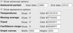
Temperature trend calculator: optional controls

If you click the ‘Advanced options’ checkbox, you can also select the period used for the autocorrelation calculation, which determines the correction which must be applied to the uncertainty. The period chosen should show a roughly linear temperature trend, otherwise the uncertainty will be overestimated. Using early data to estimate the correction for recent data or vice-versa may also give misleading results. The default period (1980-2010) is reasonable and covers all the datasets, including the BEST preliminary data. Foster and Rahmstorf use 1979-2011.

If you click the ‘Appearance options’ checkbox, you can also control which data are displayed, the colors used, and the size of the resulting graph. To save a graph, use right-click/save-image-as.

The data section gives the trend and uncertainty, together with some raw data. β is the trend. σw is the raw OLS estimate of the standard uncertainty, ν is the ratio of the number of observations to the number of independent degrees of freedom, and σc is the corrected standard uncertainty. σc and σw are always given in units of °C/year.

Acknowledgements:

In addition to papers quoted in the article, Tamino's 'Open Mind' blog provided the concepts required for the development of this tool; in particular the posts Autocorrelation, Alphabet soup 3a, and Alphabet soup 3b. At 'Climate Charts and Graphs', the article Time series regression of temperature anomaly data also provides a very readable introduction. Google's 'excanvas' provides support for Internet Explorer browsers.

Thanks to Sphaerica, Andy S, Sarah, Paul D and Mark R, Neal and Dana for feedback, and to John Cook for hosting the tool.

Data was obtained from the following sources: GISTEMP, NOAA, HADCRUT, RSS, UAH, BEST.

For a short-cut, look for the Temperature Trend Calculator Button in the left margin.

0 0

Printable Version  |  Link to this page

Comments

1  2  Next

Comments 1 to 50 out of 98:

  1. A great tool, thank you. At first impressions very user friendly and clearly explained here. One possible problem, though it might just be me - you say "To save a graph, use right-click/save-image-as." However this doesn't work for me, it's not recognising it as a separate image. I can select the section and copy it, but this doesn't give me the scale or axis labels.
    0 0
  2. This looks really cool; I may or may not want to play with it a little later. I may not because I'm already disheartened by this bit of news about "...global-mean temperature increases of 1.4–3 K by 2050, relative to 1961–1990, under a mid-range forcing scenario...". Man I hope they are way off; relative to _1961-90_ and _mid-range_ forcing caught my eye. I know, a bit OT; only thinly connected.
    0 0
  3. OPatrick: Thanks! It didn't occur to me check browser compatibility of save-as. This feature depends on the browser providing a tool to turn an HTML5 canvas into a virtual image. A quick check now shows that it works in Firefox 3.6 but not in google Chrome 17. If it doesn't work in your browser, I'm afraid you'll have to fall back on using a screenshot tool.
    0 0
  4. Kevin, it looks great, and it all worked for me. And thanks for the kind words. I found a discussion here (near the end) of how to convert a canvas image to a PNG file.
    0 0
  5. A very nice tool, thanks. Great work on putting that together. It's useful to see the uncertainty bounds for the different datasets over different time periods.
    0 0
  6. Very useful. Thanks. A nice-to-have would be the ability to create a hyperlink to a specific graph (like woodfortrees offers). D.
    0 0
  7. Better than that would be a shortened url rather than the long ones woodfortrees does.
    0 0
  8. A nice tool and created by a volunteer.
    0 0
    Moderator Response: [DB] Fixed text.
  9. I'm sure I'm not the only know-little in the climate debates who has been looking for a way to glean statistical significance of a trend without taking a stats course. But I'm still not sure how or if I can use this tool to do that. As I was fiddling about trying to understand the variables, I ran the tool for HadCRUt global temp data from 1995 to 2012 - 17 years minimum, and with interest in the 1995 trend per the 'controversy' following phil Jones' comments of a few years ago. Trend: 0.081 ±0.129 °C/decade (2σ) β=0.0081091 σw=0.0016822 ν=14.770 σc=σw√ν=0.0064651 As far as I can read it - just looking at the first line - no trend is evident due to the uncertainty being larger than the estimate. I'm probably wrong in several ways, I'm sure - but if not then HadCRUt shows no trend for a period that skeptics are latching onto as the 'alarmist approved', gold-standard minimum time period for statistical significance in the global temp records. Whatever the case, this is a bit confusing (to me) considering Phil Jones more recent comment on the trend, with more data available, being both positive statistically significant. If an expert has time and interest in educating the maths idiots out here, a post of examples using some of the popular time frames and showing how statistical significance is gleaned from the tool, would be great. For example; showing how the HadCRUt trend from 1995 shifted from 'just barely' statistically signficant to statistical significance a la Phil Jones' comments; showing why the trend from 1998 is not statistically significant but the trend from 1988 is. And maybe showing what happens to the significance variables around the 17-year mark. Do I need to take a course, or can a complete noob use this tool to declare a trend is or isn't statistically signficant?
    0 0
  10. barry @13:42, I believe that when Steve Jones claimed statistical significance, he did not allow for the auto-correlation of temperatures, and hence understated it. He was also talking about the 1995-2011 interval, which is closer to significant, and probably is "significant" if you ignore auto-correlation (which means precisely nothing except that he was accurately reporting on an inaccurate measure). Of course, reporting on just HadCRUT3 is a kind of cherry picking, as is simply reporting statistical significance or lack of it. There are three major temperature indices, whose trends from 1995-2012 lie in the following ranges: HadCRUT3 : -0.048 to 0.21 oC/decade NOAA: -0.017 to 0.213 oC/decade GISTEMP: 0.01 to 0.25 oC/decade So, even if we had nothing but HadCRUT3, we would have to conclude that the underlying trend is as likely to be 0.21 oC/decade as -0.048, and more likely to be 0.16 oC/decade than to be 0 oC/decade. That hardly supports denier claims that the temperature (understood as the underlying trend) is flat. What is more, it is not the only evidence we have on the underlying trend from 1995-2012, even just using HadCRUT3. For example, the trend from 1975-2012 lies in the range 0.121 to 0.203 oC/decade. Because of the overlap, that indicates is prima facie evidence that the underlying trend from 1995 to 2012 lies in the same interval, evidence that has not been "defeated" (to use a technical term from epistemology) by more recent data. Further, because we have three indices, absent compelling reason to think one of them flawed we should weight each of them equally. Doing so gives a trend range of 0.012 to 0.224. In other words, going on the total range of the data, the warming has been statistically significant over that period. (Please note that I am excluding the satellite indices from this comparison because they are much more effected by ENSO events. As a result they are much noisier data and have a much longer interval before we can expect statistically significant trends to emerge. As such they are not strictly comparable for this purpose. If you used an ENSO corrected version of the indices, all five should be used for this sort of comparison.) Of course, the kicker is that one of the three indices is known to have significant flaws, and despite the fantasies of the fake "skeptics", that one it HadCRUT3. With the release of information about the forthcoming HadCRUT4, it becomes clear that the lack of Arctic stations in HadCRUT3 has biased the index low. Kevin C has two forthcoming posts on other known features of HadCRUT3 which bias the trend low.
    0 0
  11. Thanks, Tom. I know you meant to say Phil Jones. :-) Still don't know if or how I can use the SkS temp trend calculator to determine if a trend is statistically significant or not. Your reply only confused me more. I didn't mean to make hay out of the Jones/1995 thing, but while we're here... Laypeople like myself rely primarily on a coherent narrative. The skeptical camp don't offer a whole bunch of that, so it is particularly striking when mainstream commentary seems to deviate. Prima facie evidence is that 17 years is a good minimum time period to establish a robust climatc trend. (If that is too simple-minded, then mainstream commenters may have contributed to that understanding by heralding the result as a way of dismissing the memes about shorter-term trends) Being a failry avid follower of the debate, I've long been aware of the lack of polar coverage in the HadCRUt set (currently being replaced with version 4), the perils of cherry-picking, and the noisier satellite data. IIRC, Santer determined the 17 year minimum using the noisier TLT satellite data, so your concern about avoiding RSS and UAH may not apply? On the one hand I've got the 17-year minimum for statistical significance that should apply comfortably to surface temperature data, and on the other an uncertainty interval that is larger than the trend estimate, suggesting (to my stats-starved brain) the null hypothesis (of a flat trend) is not rejected for the HadCRUt3 data. This has implications for the Phil Jones/1995 trend narrative as exposited by the mainstream camp. If I have to refer to a longer-term trend to get the picture, as you say, how do I now read the recommendation of Santer et al that 17 years is a standard minimum to get a robust climatic trend? Somewhere along the road here I have failed to learn (most likely), or the description on how to read the significance values is not quite clear enough in the top post. In any event, I'm all eyes for a better education.
    0 0
  12. Barry @11, the null hypothesis is not that there is no trend. Actually, I don't like the term "null hypothesis" because it is as misunderstood and abused as the term "falsification", and generally when it pops up in argument, the "null hypothesis" always turns out to be the hypothesis that the person arguing wants to be true. In general, it is far better, and far more transparent to be good Popperian's and simply state whether or not the test results may falsify the hypothesis being tested. ("May" because approx 1 in 20 tests will fail the test of statistical significance even if the hypothesis is true. Seizing on just one example of this and saying, "look the theory has been falsified" simply demonstrates that you do not understand falsification.) Whatever the time frame, the trend is statistically significant if its two sigma (95%) confidence interval does not include a given test condition. So, if we want to say that the trend is positive, that passes the test of statistical significance if and only if no trend line within the two sigma confidence interval is negative. If we want to claim the medium term temperature trend of approximately 0.17 oC/decade has ended, that claim is statistically significant if and only if the trend of 0.17 oC/decade does not lie within the two sigma confidence interval. If we want to say the purported IPCC predicted trend of 0.2 oC/decade has been falsified, that claim is statistically significant if and only if the trend of 0.2 oC/decade lies outside the two sigma confidence interval. The two sigma confidence interval for the trend from 1995 to 2012 using the HadCRUT3 data is -0.048 to 0.21 oC/decade. Therefore, the claim that the temperature trend over that interval is not flat, the claim that it has changed from the ongoing trend, and the claim that it has falsified the IPCC predicted trend are all not statistically significant. Fake "skeptics" often want to treat the truth of the first of these claims as a proof that the other two are false. At the best, they are trying to draw attention to that fact while scrupulously not explaining that it is in no way evidence that the other two claims are false (which is disingenuous). As it stands, the lack of statistically significant warming from 1995 to 2012 as measured by HadCRUT3 is no more evidence that the long term trend has ended than was the lack of statistically significant warming from 1981-1998 on the same measure. And of course, Foster and Rahmstorf show quite conclusively that the underlying trend does in fact continue.
    0 0
  13. Barry: I agree, the uncertainties calculated by this method do not support Phil Jones' claim that HadCRUT3v snuck into statistical significance from 1995 part way through 2011. If I remember correctly, Lucia performed a very critical analysis of Jones' claim over at the blackboard. I think she deduced that his claim was based on calculating annual means, and then calculating the simple OLS trend and uncertainty on the annual means. That is a rather more crude way of dealing with autocorrelation, and while much better than using OLS on the monthly data, it still tends to underestimate the uncertainty a bit. Therefore, to my best understanding Jones' claim was wrong. (Caveats: estimating the autocorrelation is also noisy, and Tamino's method may not be optimal. I'm interested to see where Nick Stokes goes with this - he is certainly in Tamino's league when it comes to statistics.) As to what is going on with HadCRUT3 - there will be another post along shortly!
    0 0
  14. I did a study of Phil Jones observation here (near the end). I think he's right. Significance goes down as you take account of autocorrelation. I found that if you don't allow for it, the trend of Hadcrut3 since 1995 is highly significant (t-stat of 5). But if you allow for AR(1) dependence, it comes down to 2.1, just marginally significant. As noted in Foster and Rahmstorf, AR(1) isn't quite good enough. I tried AR(2), which brought it down to just below significance. But most people think AR(1) is reasonable, and I think that's probably what he used. And I think that measure did cross the line somewhere during 2010/11.
    0 0
  15. @barry, essentially if you can draw an horizontal line within the "error bars" covering the whole period of the trend, then it isn't statistically significant (as a flat trend is consistent with the data). Regarding Phil Jones' comment, the trend under discussion was hovering about the boundary between "significant" and "not significant", so small changes in the way the calculation is performed is likely to change the result. I want to congratulate Kevin C on an excellent job, the trend calculator gives a very good indication of the uncertainties, and is definitely more accessible to a non-statistical audience than explaining what statistical significance actually means (and more importantly, what it doesn't mean).
    0 0
  16. Oh yes, Nick's explanation (Jones was using AR(1)) seems more plausible than Lucia's (Jones was using annual averages), given the wide use of AR(1) in the field.
    0 0
  17. Kevin - thanks for a straight answer. It seems I can make use of the tool in a limited way after all. I'll keep plodding. It seems that one were best to avoid making bold statements on trends that border on being statistically/not statistically significant. A bit more data, a few more months in this case, can undo your assertion. I liked Robert Grumbine's Jan 2009 post (one of a series) on minimum periods to usefully determine global temp trends (20 - 30 years). Santer et al (17 year minimum) and Tamino (and I think Rahmstorf in a 2007/8 paper on the most recent 17-year temp trend) have indicated that less than a couple of decades is sufficient to get a statistically significant trend, but it appears that these are unfortunate suggestions to have advanced in the popular debate. At 17 years to present, NOAA, HadCRUt, RSS and UAH all fail statistical significance (using the SkS tool - I think!). A theme that keeps popping up for me as a reader is the problem of balancing completeness with making things accessible to a lay audience. The 17-year thing (which is now cited in the skeptiverse), and Jones' latter comment on statistical significance in the HadCRUt record being achieved, which was made into a post here, are good examples. It seems to me that the message can be pushed harder than the facts when they are oversimplifed. Bookmarked this page and look forward to making use of the great new gadget. Thanks be to the creators.
    0 0
  18. Barry, my takeaway from Santer is that a 17-year minimum length of time series is the minimum under "normal" circumstances. As Tamino and others have shown, under optimal conditions, a shorter time series may return a series surviving significance testing, but only after rigorously controlling for exogenous factors to minimize spurious noise. HTH.
    0 0
  19. Barry, following on from what Daniel says, the "normal circumstances" for statistical significance tests include the period you are looking at being randomly chosen. In this case the period is not randomly chosen, the question that Phil Jones was asked was loaded by having a cherry picked start/end date, which biases the test towards the desired result. "Warmists" could similarly bias the test by starting the period in say 2000, and the fact that they don't (other than to show why cherry picking is a bad thing) shows who is seeking the truth and who isn't! ;o) IIRC Phil Jones actually gave a very straight answer to the question (no it isn't significant, but it is very close to being significant and that you need more data to be able to expect to reach significance). I suspect that much of the misunderstanding is due to some sceptics having only a rather limited understanding of what significance tests actually mean. Unfortunately they are not straightforward and are widely misunderstood in the science, and even amongst statisticians! ISTR reading a paper where the authors had performed a survey of statistics students understanding of the p-value, and compared that with the answers given by their professors. A substantial majority of the professors failed to get all five/six questions right (I would have got one of them wrong as well). So if you struggle with statistical significance, take heart from the fact that we all do, including statisticians! ;o)
    0 0
  20. Can we have ones for : SLR, Extrem Weather, oil price....:)
    0 0
  21. "the IPCC projection of 0.2°C/decade" Can you give a reference for this? IIRC the IPCC report actually says "*about* 0.2C/decade" - while it may seem like a nitpick, the difference does matter as (for example) 0.17C is by any reasonable interpretation "about 0.2C", but it's not 0.2C. I think this "0.2C' claim actually originates with 'skeptics', and not the IPCC (as by exaggerating the IPCC claim and neglecting the uncertainty, it makes for an easier strawman to attack, at least in the short term).
    0 0
  22. Here's the exact quote. "For the next two decades, a warming of about 0.2°C per decade is projected for a range of SRES emission scenarios" I think a reasonable range for "about" would 1.5C - 2.5C per decade. Almost always overlooked is the time frame stipulated - two decades is likely a long enough period for the signal to become apparent. Literally speaking, the estimate should be checked in 2026, 20 years after the 'projection.' And the prediction does not include the possibility of significant events that could skew the predicted trend from CO2 warming, like a series of major volcanic eruptions. For the die-hard skeptics, perhaps the forecast could have been qualified, "all other forcings being equal" or some such.
    0 0
  23. Daniel @18 Well said. So it seemd to me. My point is that those caveats weren't clearly exposited when mainstream commenters introduced the matter to the lay audience. Hence, skeptics can now exploit the simplified version to advantage. I don't have any answers to the perennial balancing act in reporting science to the GP. It's a tough gig, particularly when there are commenters and pundits who are mining for any tittle that supports their agenda rather than helping to shed light on understanding.
    0 0
  24. Dikran @19 it is some comfort to know even the experts struggle with this. It is a devil of an issue in the climate debates. Hard to explain and easily misunderstood, when indeed it is even brought up, as it should be. Tamino has to be recognized as a great educator on this. RC, Open Mind and SkS, my top three sites on the mainstream explanation of the AGW issue. Cheers.
    0 0
  25. barry@24 Tamino is indeed a great educator on statistical topics, especially time series analysis. The key mistake the sceptics make is to assume that no statistically significant warming means that there is no warming. If there is no statistically significant warming, it means either there is no warming, or there is warming, but there is not enough evidence to rule out the possibility that it is not warming (loosely speaking). If you use too short a period, then the latter becomes more likely. The flip side of statistical significance is statistical power, which basically measures the probability of getting a statistically significant trend when it is actually warming at the predicted rate. However the skeptics never mention the statistical power of the test and generally refuse to discuss it when raised (see the discussion with Prof. Pielke at SkS). RC, OpenMind and SkS are also my top three sites, but not necessarily in that order. ;o)
    0 0
  26. Fantastic tool. That is all I have to say.
    0 0
  27. Hi. Like the calculator but noticed the following: If I find a trend for NOAA for 1980-2010 it is 0.162C/decade which is a warming of 0.486C for the 30 years. If I find separate trends for 1980-1990 (0.071), 1990-2000(0.227) and 2000-2010(0.064), for the 30 years gives a warming of 0.362C. Similar differences obtained when using GISTEMP or HADCRUT3 I am naive expecting these to be the same? Be patient.
    0 0
  28. reg61, I'll let Kevin give you a more specific answer, but if you look at the controls you'll notice the "12 month moving average" control. I'm not sure how Kevin programmed it, but it looks (from the graph presented) that if you use a date range of 1980-1990, you're missing the first 6 months of 1980 and the last 6 months of 1990, because there isn't enough data around that point to compute the moving average. [Yes, you could argue that he should program it to include those points, and so go back prior to/beyond that to get the data to compute that point, but... he didn't.] So for example, if you compare 1979.5-2010.5 with 1979.5-1990.5, 1990.5-2000.5, and 1999.5 to 2010.5, you'll get a lot closer. It's still not exactly the same because computing a trend is not like just taking the difference between your starting and ending points. As I said, I'll let Kevin explain further, but short answer... yes, you're naive to expect them to be the same.
    0 0
  29. Sphaerica Thanks for the explanation. Tried your method and it does make the difference closer. I was not expecting them to be exactly the same but the differences (25-29% of the 30 year trend) when I worked them out did seem on the large side.
    0 0
  30. To make your trend calculator utility easier to use, I recommend you provide more specific instructions on the main parameter entry screen. The prompt "Start Date", suggests that the entry could refer to a specific day rather than the year, which leaves open many possible formats. Entering a day rather than a year returns the rather unhelpful error message "Insufficient data for trend calculation", which provides no hint that the date is in the wrong format. Optionally, you could omit the prompt "Trend Calculation", although there's plenty of space available. The following instruction might work: Enter data range (Format "YYYY[.Y]"): Start date: _____ End date: ______. Also, you might add a hyperlink on each of the two trend calculators to jump from one to the other. Nice work on this, BTW! Much appreciated!
    0 0
  31. reg61 you'd be right only if the 30 years trend is perfectly linear, which is not. The larger the difference between the decadal trends the more easily you'll find discrepancies. Plot together the 30 year trend and the three decadal trends and you'll see the effect. Also notice that the trends come with an error you should take into account.
    0 0
  32. Note that adding up the trends of three segments would only match the overall trend if the three linear segments also intersected at the dividing points - i.e., if years X and Y are the dividing points between the three segments, then the linear fits for segments A and B would have to calculate the exact same temperature value for year X, and segments B and C would have to match at year Y. This is unlikely, and Riccardo's perfectly linear overall trend is one of the few cases where they would. The best example of how different segments do not match up is the Escalator graph, featured on the upper right corner of every SkS page. Look at how different the temperature values are at the dividing year of the short "trends" in the "skeptics" version. There is no way that those trends will add up to the correct value of the realists' overall trend. Every short segment has a large vertical displacement from the adjacent one(s). It is mathematically possible to force several line segments to intersect at the dividing X value, but you end up with an additional constraint on the regression, and a different result from what you get with three independent fits.
    0 0
  33. Thanks for those clear explanations. Probably a Dhoo moment called for.
    0 0
  34. Can I ask what may be a silly question (and one that may have already been answered). I was wanting to understand more about how the errors are calculated. If I'm teaching in a first-year physics lab (as I have) the way I would illustrate errors is to get the students to plot a graph with the measurements and with an error bar for each measurement (say nuclear decay for example). They would then determine the best fit line. The error could then be estimated by drawing two other lines, one steeper and one shallower. If they wanted 1-sigma errors then the two other lines should each pass through about two-thirds of the error bars. If they wanted 2-sigma errors, then the two other lines should pass through 95% of all the error bars. They can determine the gradient for the best-fit line and the gradients of the two other lines and they can then state the trend plus the error. Is this similar to what is done to determine the errors here and if so, what are the errors on the data points?
    0 0
  35. KenM: Very good question. The answer is no, that is not what is happening. We don't have error bars on the data points - ordinary least squares doesn't use them. What ordinary least squares does is calculate the best fit straight line, and infer the errors in the data points from the deviations from that line. If the underlying data is truly linear with normally distributed errors in the dependent variable, then this gives the same result as using the true errors. Of course if the underlying process is not linear, then this gets rolled into the errors, which would not be the case when the error bars are known.
    0 0
  36. Could someone tell me why I get a discrepancy between what the tool says and what Tamino determined in this post. Tamino determined the trend error range for GISTemp 1975-2008 as being ± 0.0032 deg C/year. The tool says it's ± 0.0049 deg C/year. Why is there such a large discrepancy?
    0 0
  37. Chris O'Neill - That older Tamino post used an AR(1) noise model, whereas the current work uses a more accurate ARMA(1,1) model, as described in the Methods section of Foster and Rahmstorf 2011.
    0 0
  38. Is there any chance that Foster's and Rahmstorf's 2011 treatment of the global temperature record could be added as an option for the calculator? And if it's not too cheeky to ask, would it be possible to include an option that permits the return of the type of graph I posted a few days ago?
    0 0
  39. Bernard J. - There is a variation removed version that can be found from the Trend Calculator link entitled:
    "See here for more information."
    Moderators - perhaps this link could be directly accessible (and labeled) from the Trend Calculator page?
    0 0
  40. Kevin C, thanks. That makes sense. So the trend is from minimising the sum of the squares and the error is based on the standard deviation of the sum of the squares. I actually downloaded some data (GISTEMP) and wrote a little code of my own. I can reproduce the trend but, for some reason, the 2 sigma error seems to be about a factor of 2 smaller than the trend calculator here gives. This is probably getting more technical for this comments page, but is there something else needed to get the error, a weighting for example?
    0 0
  41. KR. Thanks for that. It's been a while since I read the top of the original post so I missed the second button. Now I can have some fun.
    0 0
  42. KenM, temperature series are strongly autocorrelated. You must account for this to get proper error bounds (ie not a simple LS error).
    0 0
  43. Scaddemp, thanks. That would explain it. I am just using the LS error.
    0 0
  44. "For the next two decades, a warming of about 0.2°C per decade is projected for a range of SRES emission scenarios. I think a reasonable range for "about" would 1.5C - 2.5C per decade." Rather than guess at what the IPCC mean by about 2oC it would actually be possible to download the model mean from the CMIP5 ensemble and use that as another data set in this tool. Then we could have a true apples to apples comparison. It's possible to get the data from KNMI climate explorer. As an example here's the model mean from the rcp45 experiment. Just as a word of warning I think comparing F&R2011 with the expected warming rates from the model means is somewhat flawed. F&R2011 have removed some of the forcings (solar and volcanic) from the observational data in order, in their words, to make the global warming signal evident. The model means still have these included, you can see the volcanic effects in graph I linked to as short, sharp periods of cooling. Again if you wanted to do a true apples to apples comparison of the expected trend with F&R then you would have to return the volcanic and solar forcing to the data. I think a comparison of the model mean with F&R2011 with volcanic and solar effects returned to the data and therefore just the short term variability of ENSO removed would be an interesting experiment.
    0 0
  45. HumanityRules - See the discussion of Rahmstorf et al 2012 for roughly that approach, where the F&R 2011 variation corrected data is compared to projections without those variations, an exercise resulting in confirmation of the IPCC models: Observed annual global temperature, unadjusted (pink) and adjusted for short-term variations due to solar variability, volcanoes and ENSO (red) as in Foster and Rahmstorf (2011). 12-month running averages are shown as well as linear trend lines, and compared to the scenarios of the IPCC (blue range and lines from the 2001 report, green from the 2007 report)...
    0 0
  46. Humanity Rules @44, while individual models have ENSO like variations, and include randomly placed volcanic events, because the timing of these events is random, they are filtered out in the multi-model mean. Further, forcing projections do not include variations in solar activity. Consequently the multi-model mean does not include ENSO, volcanic and solar variation after (approximately) 2000, although they will include solar and volcanic forcings prior to that. Consequently, your essential premise is just false; and a more accurate comparison is between ENSO, volcanic and solar adjusted temperatures and model projections. A still more accurate comparison is with the trend line of the adjusted temperature series, which excludes the residual variability in observations which also vanishes from the multi-model mean (againg, because the timing of the fluctuations varies between model runs).
    0 0
  47. Kevin,
    I've been puzzled about the 2σ confidence intervals on your calculator. They seem to have a high spread. I checked, for example, Hadcrut 4 from Jan 1980 to Jul 2013. The SkS calc says 1.56+-0.47 °C/Cen. But if I use the R call
    arima(H,c(n,0,0),xreg=time(H))
    with n=0,1,2 for AR(n), I get
    1.56+-0.131, 1.55+-0.283, 1.53+-0.361
    Your se seems higher than even AR(2).

    0 0
  48. Nick Stokes - As per Foster and Rahmstorf 2011, the noise process is computed as ARMA(1, 1), not AR(n), as a simple autoregressive model turns out to underestimate autocorrelation in the temperature data. See Appendix 1

    This is discussed in the Trend Calculator overview and discussion. 

    0 0
  49. KR,

    Thanks, I should have looked more carefully at the discussion above. I did run the same case using ARMA(1,1)

    arima(H,c(1,0,1),xreg=time(H))

    and got 1.52+-0.404, which is closer to the SkS value, although still with somewhat narrower CIs.

    0 0
  50. Nick Stokes - According to the Trend Calculator ("Show advanced options" dropdown), the default ARMA(1,1) coefficient calculation is derived from 1980-2010 data. Using 1980-2013 the reported trend is 1.56 ±0.42 °C/century, rather closer. I suspect the difference is due to different ARMA(1,1) calibration periods, with the arima function using the entire period by default. 

    0 0

1  2  Next

You need to be logged in to post a comment. Login via the left margin or if you're new, register here.


The Consensus Project Website

THE ESCALATOR

(free to republish)


© Copyright 2025 John Cook
Home | Translations | About Us | Privacy | Contact Us
pFad - Phonifier reborn

Pfad - The Proxy pFad of © 2024 Garber Painting. All rights reserved.

Note: This service is not intended for secure transactions such as banking, social media, email, or purchasing. Use at your own risk. We assume no liability whatsoever for broken pages.


Alternative Proxies:

Alternative Proxy

pFad Proxy

pFad v3 Proxy

pFad v4 Proxy