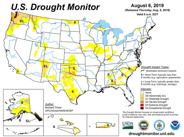
U.S. Drought Monitor (USDM)
National Drought Mitigation Center (NDMC), the U.S. Department of Agriculture (USDA), and the National Oceanic and Atmospheric Administration (NOAA)
The U.S. Drought Monitor (USDM) is a map that is updated each Thursday to show the location and intensity of drought across the country. The USDM uses a five-category system, labeled Abnormally Dry or D0, (a precursor to drought, not actually drought), and Moderate (D1), Severe (D2), Extreme (D3) and Exceptional (D4) Drought. Drought categories show experts’ assessments of conditions related to dryness and drought including observations of how much water is available in streams, lakes, and soils compared to usual for the same time of year. The U.S. Drought Monitor began in 2000 and is a collaboration between the NDMC, NOAA and the USDA, who share the weekly author role for the product. The NDMC, based at University of Nebraska, Lincoln, leads the coordination of weekly drought monitor process and provides the maps, data and statistics to the public.
Where does this come from?
Each week, drought experts consider how recent precipitation totals across the country compare to their long-term averages. They check variables including temperatures, soil moisture, water levels in streams and lakes, snow cover, and meltwater runoff. Experts also check whether areas are showing drought impacts such as water shortages and business interruptions. Based on dozens of indicators, experts make their best judgments of regional-scale drought conditions, and then check their assessments with experts in the field before publishing weekly drought maps. Associated statistics show what proportion of various geographic areas are in each category of dryness or drought, and how many people are affected.
The U.S. Drought Monitor is updated each Thursday to show the location and intensity of drought across the country, which uses a five-category system, from Abnormally Dry (D0) conditions to Exceptional Drought (D4).
The U.S. Drought Monitor is a joint effort of the National Drought Mitigation Center, U.S. Department of Agriculture, and National Oceanic and Atmospheric Administration. Learn more.
U.S. Drought Monitor Categories
The U.S. Drought Monitor is updated each Thursday to show the location and intensity of drought across the country, which uses a five-category system, from Abnormally Dry (D0) conditions to Exceptional Drought (D4).
The U.S. Drought Monitor is a joint effort of the National Drought Mitigation Center, U.S. Department of Agriculture, and National Oceanic and Atmospheric Administration. Learn more.
Access
Compare Two Weeks: Compare two U.S. Drought Monitor weeks side by side.
USDM Map Comparison Slider: Displays the USDM maps from two selected dates with a slider bar to compare how dry and drought areas changed.
Time Series: View a graph of the U.S. Drought Monitor statistics for a chosen area.
Map Archive: View any map format for a selected week.
Drought Summary: View the weekly narrative for a selected week.
USDM Change Maps: View a series of change maps for a selected week.
USDM Animations: View an animation of maps for a selected period or download animated GIF files.
Drought.gov Historical Time Series Tool: View the time series and maps in a unified page.
Tabular Data Tables: View the U.S. Drought Monitor data in tabular format for a selected area.
Web Services / GIS data: Download data in GIS formats and access Web Map Service endpoints.
Get Emails When Conditions Change
Want to receive emails when U.S. Drought Monitor conditions change for your location? Sign up for Drought.gov's local drought alert emails.
Documentation
U.S. Drought Monitor Background: Helpful links to general information, specific technical instructions, and referenced articles related to this dataset.
U.S. Drought Monitor Percentiles: Explanation of the Drought Monitor percentile category ranges.
Relevant publications:
Svoboda, M., and Coauthors, 2002: The Drought Monitor. Bull. Amer. Meteor. Soc., 83, 1181–1190, doi:https://doi.org/10.1175/1520-0477-83.8.1181


