
If you are looking for fresh snow by Christmas morning or are curious about potential travel disruptions, the best chances for at least 1" of new snowfall early this week exist across the mountainous West, Great Lakes, and Northeast. Otherwise, temperatures this last full week of December will average above normal for much of the lower 48 states. Read More >
Buffalo, NY
Weather Forecast Office
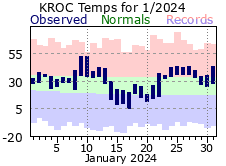
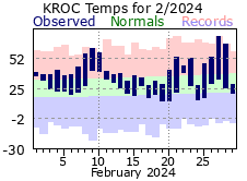
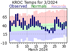
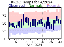
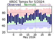
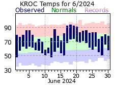
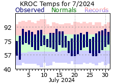
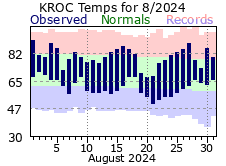
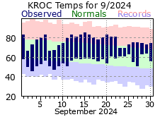
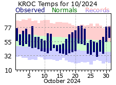
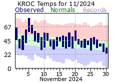
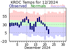
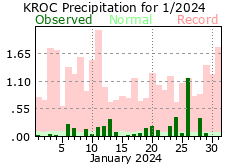
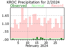
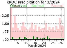
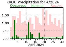
Rochester Climate Plot:
Switch to Buffalo Climate Plot
Click on the images below to enlarge
| Monthly Temperature Plots: |
 |
 |
 |
 |
 |
 |
 |
 |
 |
 |
 |
 |
|
Monthly Precipitation Plots: |
 |
 |
 |
 |
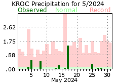 |
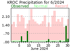 |
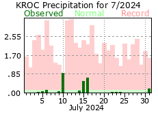 |
 |
 |
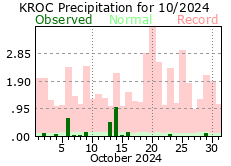 |
 |
 |
|
Forecast
Hourly Weather Graph
Graphical 2D
Aviation
Marine
Great Lakes
Fire Weather
Tropical Weather
UltraViolet Index
Winter
Air Quality
Beach
Hazards
Day 1 Outlook
Day 2 Outlook
Day 3 Outlook
National Briefing
National Warnings
Drought Monitor
Snowfall Rate Graphics
Enhanced Hazardous Weather Outlook
Climate
WNY Weather History
Buffalo Climate Graphs
Lake Effect Page
Drought Outlook
First Snowfall Facts
Winter Season Summaries
Rochester Climate Graphs
Model Data
Bufkit
Forecast Models
MOS Output
Hourly Mesoscale Analysis
Current Conditions
Sunrise/Sunset
Observations
Lake Temperatures
US Dept of Commerce
National Oceanic and Atmospheric Administration
National Weather Service
Buffalo, NY
587 Aero Drive
Cheektowaga, NY 14225
716-565-0204
Comments? Questions? Please Contact Us.


